Vanilla TS - 웹 컴포넌트 만들어보기
설정
es6-string-html을 설치하면 템플릿 리터럴의 html 코드 하이라이팅이 됩니다.
(prettier는 굳이 안 써도 사용하고 있겠죠?)
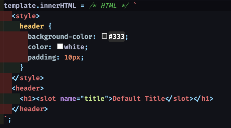
이렇게 템플릿 리터럴 앞에 /* HTML */ 주석을 달면
prettier에서 코드포맷팅을 해주고 es6-string-html 이 코드 하이라이팅을 해줍니다. (style 태그 안의 css도 포맷팅&하이라이팅 됨)
하나하나 createElement로 노드를 조작하면, 복잡해질수록 가독성과 유지보수가 너무 어렵기 때문에 템플릿 리터럴을 사용하도록 하겠습니다. 템플릿 리터럴을 사용했을 때의 단점이 어느정도 해소됩니다.
그리고 vite로 vanilla -> ts로 프로젝트 생성해줍니다.
시작하기
https://ko.vite.dev/guide/build.html#multi-page-app
(만일 MPA를 만들고자 하자면 진입점을 따로 설정해주면 됩니다!!!)
웹 컴포넌트 만들기
https://developer.mozilla.org/ko/docs/Web/API/Web_components
Vite
Vite, 프런트엔드 개발의 새로운 기준
ko.vite.dev
api를 다 알 필요 없고 mdn에 매우 잘 정리되어있습니다.
이 페이지의 튜토리얼 파트를 봅시다. 템플릿과 슬롯은 vue를 사용했다면 익숙한 개념입니다.
바로 생명주기 봅시다.
class TestElement extends HTMLElement {
  constructor() {
    super();
  }

  // 커스텀 엘리먼트가 추가될 때
  connectedCallback() {}

  // 커스텀 엘리먼트가 연결 해제되었을 때
  disconnectedCallback() {}

  // 커스텀 엘리먼트가 새로운 document로 이동되었을 때
  adoptedCallback() {}

  // 어트리부트가 추가/제거/변경
  attributeChangedCallback(name, oldValue, newValue) {}

  // 어떤 어트리부트가 변경될 때 감지할지 명시
  static get observedAttributes() {
    return ["attr"];
  }
}
이와 같은 형태로 작성하면 됩니다.
일단 빠르게 컴포넌트 만들어봅니다. 그냥 html 캡슐화 하려면 생성자만 있어도 됩니다.
this는 HTMLElement를 상속받은 커스텀 엘리먼트, 내가 만든 웹 컴포넌트가 됩니다.
그냥 innterHTML에 템플릿 리터럴로 html을 때려박아요.
그리고 define해주면 끝.
class TestElement extends HTMLElement {
constructor() {
super();
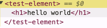
this.innerHTML = /*HTML */ `<h1>hello world</h1>`;
}
}
customElements.define("test-element", TestElement);main.ts 에서는 그냥 import 만 해줬어요.
import './components/test';
<!doctype html>
<html lang="en">
  <head>
    <meta charset="UTF-8" />
    <link rel="icon" type="image/svg+xml" href="/vite.svg" />
    <meta name="viewport" content="width=device-width, initial-scale=1.0" />
    <title>Vite + TS</title>
  </head>
  <body>
    <div id="app">
      <test-element/>
    </div>
    <script type="module" src="/src/main.ts"></script>
  </body>
</html>
index.html은 이렇게 되겠죠.
잘 됩니다.
여기서 render 메소드를 분리해서, 렌더링하는 부분은 따로 빼줄게요.
class TestElement extends HTMLElement {
  constructor() {
    super();
  }

  connectedCallback() {
    this.render();
  }

  render() {
    this.innerHTML = /*HTML */ `<h1>hello world</h1>`;
  }
}

customElements.define("test-element", TestElement);
그다음 shadow dom 이 적용되도록 변경하겠습니다.
shadow dom 을 사용하면 스타일을 캡슐화 할 수 있는 장점이 있어요.
멤버변수를 추가해줍시다.
class TestElement extends HTMLElement {
  private shadow: ShadowRoot; // 추가

  constructor() {
    super();

    this.shadow = this.attachShadow({ mode: "open" });
  }

  connectedCallback() {
    this.render();
  }

  render() {
    this.shadow.innerHTML = /*HTML */ `<h1>hello world</h1>`;
  }
}

customElements.define("test-element", TestElement);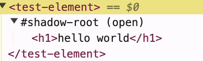

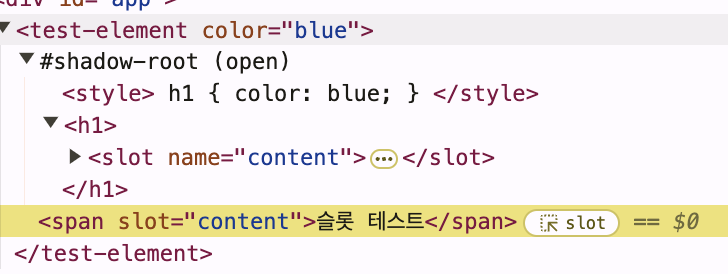
이제 attribute로 color를 받고 slot으로 내부 컨텐츠를 받도록 해보겠습니다.
그리고 attribute가 바뀌면 감지할 수 있게 observedAttributes의 return 배열에 추가, attributeChangedCallback도 추가
class TestElement extends HTMLElement {
private shadow: ShadowRoot;
private state = {
color: "pink",
};
constructor() {
super();
this.shadow = this.attachShadow({ mode: "open" });
}
get template() {
const template = document.createElement("template");
template.innerHTML = /* HTML */ `
<style>
h1 {
color: ${this.state.color};
}
</style>
<h1><slot name="content">DEFAULT TEXT<slot></h1>
`;
return template;
}
connectedCallback() {
this.render();
}
attributeChangedCallback(attrName: string, _oldVal: string, newVal: string) {
if (attrName === "color") {
this.state.color = newVal;
this.render();
}
}
static get observedAttributes() {
return ["color"];
}
render() {
this.shadow.replaceChildren(this.template.content.cloneNode(true));
}
}
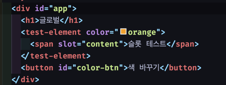
customElements.define("test-element", TestElement);<div id="app">
<test-element color="orange">
<span slot="content">슬롯 테스트</span>
</test-element>
<button id="color-btn">색 바꾸기</button>
</div>
<script type="module" src="/src/main.ts"></script>const colorBtn = document.querySelector('#color-btn');
colorBtn?.addEventListener('click', () => {
const testElement = document.querySelector('test-element');
if (testElement) {
testElement.setAttribute('color', 'blue');
}
})간단하게 메인 함수에서 테스트.


잘 됩니다.
스타일 캡슐화
@font-face {
  font-family: 'Ownglyph_ParkDaHyun';
  src: url('https://fastly.jsdelivr.net/gh/projectnoonnu/2411-3@1.0/Ownglyph_ParkDaHyun.woff2') format('woff2');
  font-weight: normal;
  font-style: normal;
}

body {
  font-family: 'Ownglyph_ParkDaHyun';
}
전역 css에 폰트를 추가하고 body 폰트를 지정해줍니다.

컴포넌트 안의 h1 스타일은 컴포넌트 안에서만 적용됩니다.
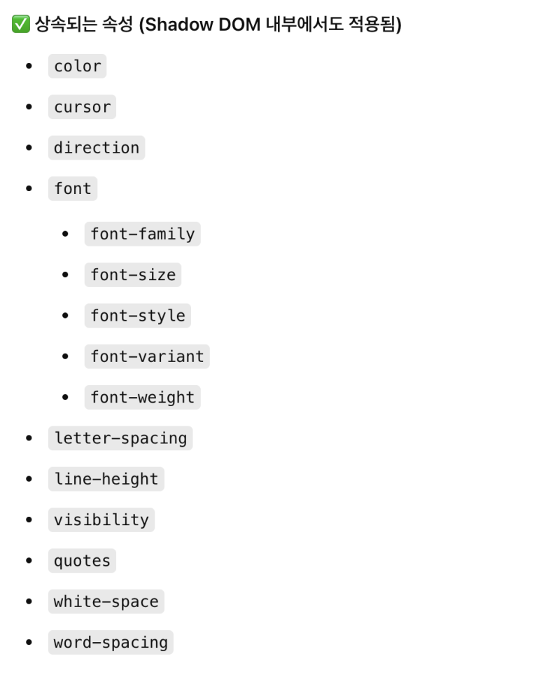
폰트 패밀리는 전역 css에서 상속됐습니다. 상속 가능한 css는 상속됩니다.
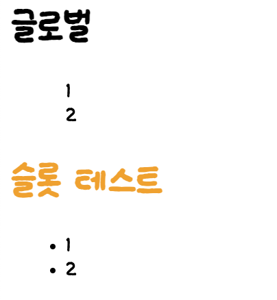
ul, li {
  list-style: none;
}
하지만 ul, li 같은 것은 상속되지 않습니다.
전역 css 가 잘 적용되어야 한다면 shadow dom 을 쓰지 않거나...
adoptedStyleSheets 을 사용해서 공통화를 해주면 될 것 같아요.
BaseComponent 추상 클래스
abstract class BaseComponent extends HTMLElement {
    protected shadow: ShadowRoot;
    protected state: Record<string, any> = {};

    constructor() {
      super();
      this.shadow = this.attachShadow({ mode: "open" });
    }

    protected abstract get template(): string;

    protected render() {
      const template = document.createElement("template");
      template.innerHTML = this.template;
      this.shadow.replaceChildren(template.content.cloneNode(true));
    }

    connectedCallback() {
      this.render();
    }

    attributeChangedCallback(attrName: string, _oldVal: string, newVal: string) {
      this.state[attrName] = newVal;
      this.render();
    }
  }

  export default BaseComponent;
추상클래스를 만들고 템플릿을 꼭 자식 클래스에서 정의하도록 만들었어요.
import BaseComponent from "./BaseComponent";

class TestHeader extends BaseComponent {

    protected state = {
        color: "Blue",
    };

    protected get template() {
        return /* HTML */ `
        <style>
            h1 {
            color: ${this.state.color};
            }
        </style>
        <h1><slot name="content">DEFAULT TEXT</slot></h1>
        `;
    }

    static get observedAttributes() {
        return ["color"];
      }
}

customElements.define("test-header", TestHeader);
BaseComponent를 상속받아 만든 TestHeader 가 동일하게 작동됩니다.
근데 생각해보니 이벤트 리스너를 안 넣어줬어요.
super.render() 호출하고 이후에 이벤트 리스너를 넣어주면 되긴할텐데 그렇게 하면 이벤트 리스너가 렌더링 될 때마다 추가되니까 이렇게 만들면 안 되겠죠.
그리고 replaceChildren 으로 자식을 교체했기 때문에 추가했던 이벤트 리스너도 없어저요.
렌더에서 매번 새로 만드는 것도 문제입니다.
attribute가 변경되면 render()가 실행될 게 아니라 자식 클래스에서 업데이트 컴포넌트를 수동으로 구현하게 할게요.
abstract class BaseComponent extends HTMLElement {
  protected shadow: ShadowRoot;
  protected state: Record<string, any> = {};

  constructor() {
    super();
    this.shadow = this.attachShadow({ mode: "open" });
  }

  protected abstract get template(): string;
  protected onMounted() {}
  protected onUnmounted() {}

  protected render() {
    const template = document.createElement("template");
    template.innerHTML = this.template;
    this.shadow.appendChild(template.content.cloneNode(true));
  }

  protected updateComponent() {}

  connectedCallback() {
    this.render();
    this.onMounted()
  }

  disconnectedCallback() {
    this.onUnmounted();
  }

  attributeChangedCallback(attrName: string, _oldVal: string, newVal: string) {
    this.state[attrName] = newVal;
    this.updateComponent();
  }
}

export default BaseComponent;
import BaseComponent from "./BaseComponent";

class TestHeader extends BaseComponent {
  constructor() {
    super();
  }

  protected state = {
    color: "Blue",
  };

  protected get template() {
    return /* HTML */ `
      <style>
        h1 {
          color: ${this.state.color};
        }
      </style>
      <h1><slot name="content">DEFAULT TEXT</slot></h1>
    `;
  }

  static get observedAttributes() {
    return ["color"];
  }

  updateComponent(): void {
    const h1 = this.shadowRoot?.querySelector("h1");
    if (h1) {
      h1.style.color = this.state.color;
    }
  }

  handleClickTitle = () => {
    console.log("Title clicked");
  };

  onMounted() {
    const title = this.shadowRoot?.querySelector("h1");
    if (title) {
      title.addEventListener("click", this.handleClickTitle);
    }
  }

  onUnmounted() {
    const title = this.shadowRoot?.querySelector("h1");
    if (title) {
      title.removeEventListener("click", this.handleClickTitle);
    }
  }
}

customElements.define("test-header", TestHeader);
이렇게 하면 의도대로 동작합니다.
그런데 컬러 바꾸는 부분을 좀 더 개선하면..
h1 {
color: var(--title-color, ${this.state.color}); // 변경
}

host.style.setProperty("--title-color", this.state.color); // 변경
import BaseComponent from "./BaseComponent";

class TestHeader extends BaseComponent {
  constructor() {
    super();
  }

  protected state = {
    color: "blue",
  };

  protected get template() {
    return /* HTML */ `
      <style>
        h1 {
          color: var(--title-color, ${this.state.color}); // 변경
        }
      </style>
      <h1><slot name="content">DEFAULT TEXT</slot></h1>
    `;
  }

  static get observedAttributes() {
    return ["color"];
  }

  updateComponent(): void {
    const h1 = this.shadowRoot?.querySelector("h1");
    const host: HTMLElement | null = this.shadowRoot
      ?.host as HTMLElement | null;

    if (h1 && host) {
      host.style.setProperty("--title-color", this.state.color); // 변경
    }
  }

  handleClickTitle = () => {
    console.log("Title clicked");
  };

  onMounted() {
    const title = this.shadowRoot?.querySelector("h1");
    if (title) {
      title.addEventListener("click", this.handleClickTitle);
    }
  }

  onUnmounted() {
    const title = this.shadowRoot?.querySelector("h1");
    if (title) {
      title.removeEventListener("click", this.handleClickTitle);
    }
  }
}

customElements.define("test-header", TestHeader);
css 변수를 사용하면 style이 변경되어 더욱 깔끔하네요.
지금까지 간단하게 웹 컴포넌트를 만드는 방법을 알아보았습니다.
사실 직접 이렇게 구현하는 건 과하고 실무에서는 lit.js를 쓰는 게 낫습니다. 하지만 레거시에 부분적으로 캡슐화 된 컴포넌트를 조금 추가할 때는 이 방법도 나쁘지 않을 수 있어요. 라이브러리를 아무것도 추가 안 해도 되니까!
저는 JSP 로 된 레거시 프로젝트 디자인 개선을 하면서 본문 내용보다는 더 단순하게 스타일만 적용된 래퍼를 웹 컴포넌트로 만들어서 사용했습니다. 이런 웹 컴포넌트를 사용하지 않으면 전체적 디자인 여백 수정을 할 때마다 리스트마다의 jsp 파일 1n 개를 수정해야 하지만, 한번 컴포넌트화를 하면 파일 하나만 수정할 수 있는 장점이 있죠.